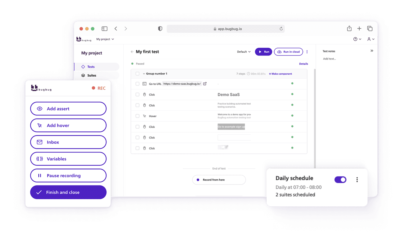
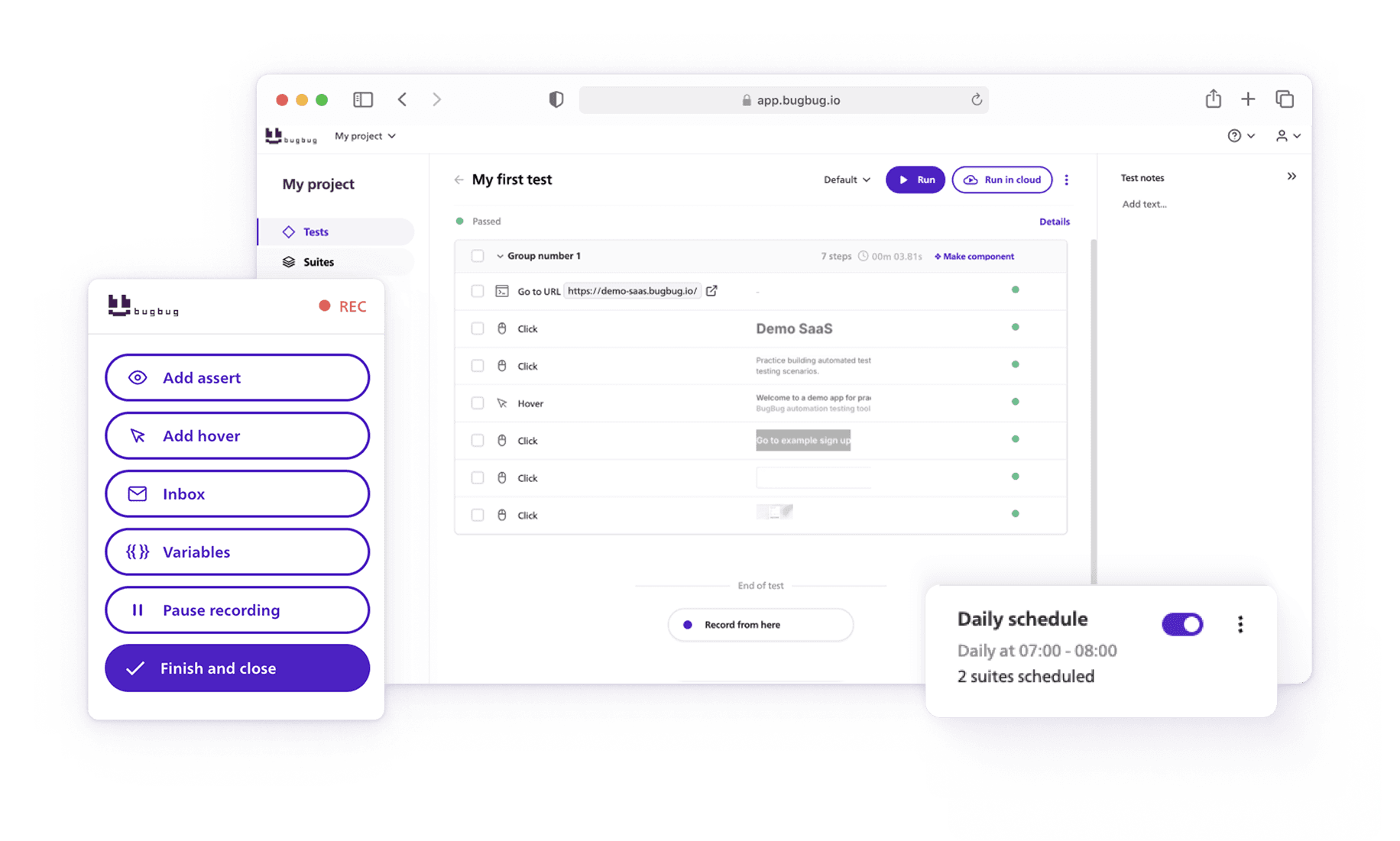
Website testing, including thorough navigation testing, is indispensable for ensuring a website meets its functional requirements, provides a superior user experience, remains compatible across devices and browsers, optimizes performance, and maintains security.
A web application testing guide can improve productivity and accuracy through automated testing, while also addressing critical aspects like security testing to protect against vulnerabilities.
It’s a critical step in web development that can significantly impact a website’s success and its ability to meet business objectives.
Check also:
Why Website Testing Is Critical?
Imagine this: you spend months building your website, designing a beautiful homepage, and writing content that explains your product perfectly. You hit “publish,” excited for new visitors to arrive. But then… the search box doesn’t work. Or the checkout button leads to an error. Or worse, the navigation links take people in circles.
This is exactly why website testing matters.
What is website testing?
Website testing is the process of checking whether your site works the way it should. It’s about making sure visitors can move smoothly from your homepage to your contact form, search for information, and complete actions—like signing up or buying—without frustration. In simple terms, it’s answering the question: “Does my website actually work for real people?”
How to test a website?
When you test a website, you don’t just click around randomly. You create a website testing plan—a checklist of things to try:
- Run a homepage test to check if images load quickly and buttons work.
- Do navigation testing to see if menus, links, and search bars guide users to the right pages.
- Try functional testing for web applications, like filling out forms, logging in, or checking out.
- Perform website UI testing to make sure the design looks good on mobile and desktop.
This way, your website gets tested from every angle: how it looks, how it behaves, and how users experience it.
1. Functional Testing for Web Applications
The main navigation is your visitor's roadmap to your website. Here's how to ensure it's working properly:
- Start by visiting the homepage. Go to sample page (in this case https://www.reserved.com/gb/en/ ) to begin.
- Interact with navigation elements. Click on various navigation links to ensure they respond as expected.
- Check for key sections. Make sure that critical sections like "Men," "Mid Season Sale," "New in," and others are clearly labeled and accessible.
- Hover over navigation items. This is to verify that any drop-down menus or additional options are displayed correctly.
- Validate proper redirection. Click on specific items like "Shoes and accessories" to ensure you're taken to the correct page without issues.
2. Testing the Search Bar Functionality
An efficient search bar can enhance user experience significantly. Here's how to test its effectiveness:
- Locate and use the search bar. Confirm that the search bar is labeled correctly and is functional.
- Perform a search operation. Use the search bar to look up a specific item, such as a "belt with rotating buckle."
- Verify search results accuracy. Ensure that the search results match the query accurately and display the correct product details, including pricing and quality statements.
3. Assessing the 'Sales' Page Link and Content Accuracy with Usability Testing
Sales pages are vital for e-commerce sites. Here's how to check if yours is up to par:
- Navigate to the 'Sales' page. Click on the link or menu item that leads to the Mid Season Sale or similar promotional section.
- Hover and click through. Engage with the page to bring up specific sale items, ensuring that hover actions reveal correct information.
- Check item details. Verify that items like "Rib knit jumper" are listed with the correct sale price, ensuring promotions are displayed accurately.
End of Test
By following these steps, you ensure that key aspects of your website - navigation, search functionality, and promotional content - are not just functional but optimized for the best user experience. Regularly testing these elements as outlined can help catch potential issues before they affect your visitors, maintaining the integrity and usability of your site.
Remember, the goal is to make your website as user-friendly and accurate as possible, so take the time to conduct these tests thoroughly.
Conclusion: The Foundation of a Reliable Web Experience with Automated Testing
Thoroughly testing web applications—especially homepages and navigation—helps ensure a bug-free, secure, and engaging site. Focus on:
- Maintaining high website performance
- Delivering a consistent user experience
- Preserving data integrity and web security
- Improving test coverage through automated testing
By incorporating structured test cases, using modern testing tools, and applying both manual and automated testing methods, your team can release with confidence.
Your broader testing strategy can also include:
- Functionality testing to check if all the features work as intended, ensuring the website’s functionality and that it functions correctly. Utilize functional testing and automation tools to enhance efficiency. Design effective test case scenarios to identify potential issues.
- Usability testing to verify intuitive user interactions, ensuring a seamless user experience. This involves manual website testing to simulate user interactions with the website’s UI, and should include accessibility testing, UX testing, and identifying usability issues.
- Performance testing for optimizing page load time and response under varying internet speeds. Conduct comprehensive performance tests to ensure optimal operation, address performance issues, and test under different network conditions.
- Security testing and penetration testing to identify vulnerabilities and protect sensitive user information. Implement secure coding practices during the testing phase to prevent vulnerabilities.
- Compatibility testing and cross browser testing across different devices, operating systems, and major browsers. Ensure cross browser compatibility, cross platform compatibility, and test across various browser versions and various devices. Conduct cross browser tests using tools like BrowserStack and Sauce Labs to evaluate performance across multiple browsers.
- Database testing to ensure data consistency and data integrity.
- Regression testing to automate repetitive tasks and ensure existing functionality remains intact after modifications.
- Written test plan to guide both automated and manual testing processes, outlining unique test scenarios.
- Test scripts to update automation scripts as new features or changes occur.
- API testing to ensure that an application’s API adheres to specified requirements and standards.
- Broken links to identify and address any links that do not direct to the correct landing pages.
- Continuous testing to integrate automated tests at every stage of the development process, ensuring high website quality.
- Continuous integration to enhance code quality and streamline the development process.
- Crowd testing to utilize a diverse group of testers for insights into usability, functionality, and overall user experience.
- Automated testing should leverage test automation tools and frameworks for efficiency, including end to end testing to cover complete user journeys.
- Testing teams should include dedicated QA teams to ensure comprehensive coverage and quality assurance.
- Mobile testing should focus on mobile responsiveness and responsive design to ensure seamless experiences across all devices.
- Happy (automated) testing!


